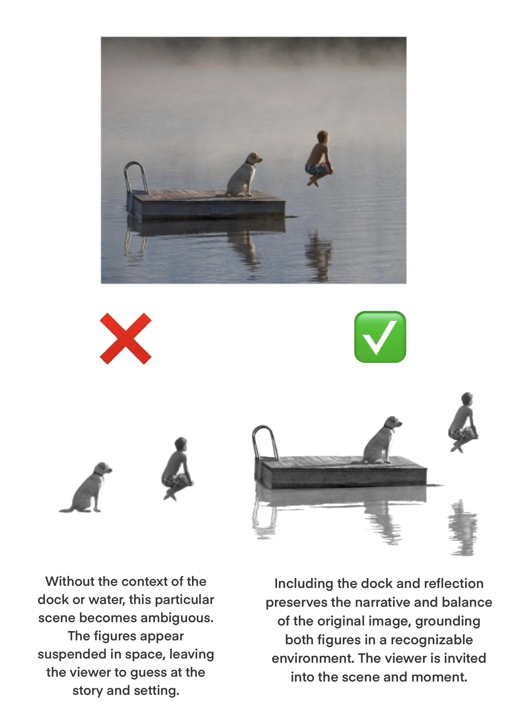
Identifying the visual principles that contribute to a strong tattoo composition.
When selecting a reference image, it’s important to consider the overall composition, not just the subject itself. For example, a family photo where the subjects lean on a car, staircase, or railing - these contextual elements ground the figure in space and add meaning to the image. Without them, body orientation can look awkward and the design loses visual impact. Visually strong compositions have a natural sense of balance and harmony, guiding the viewer’s eye with ease.


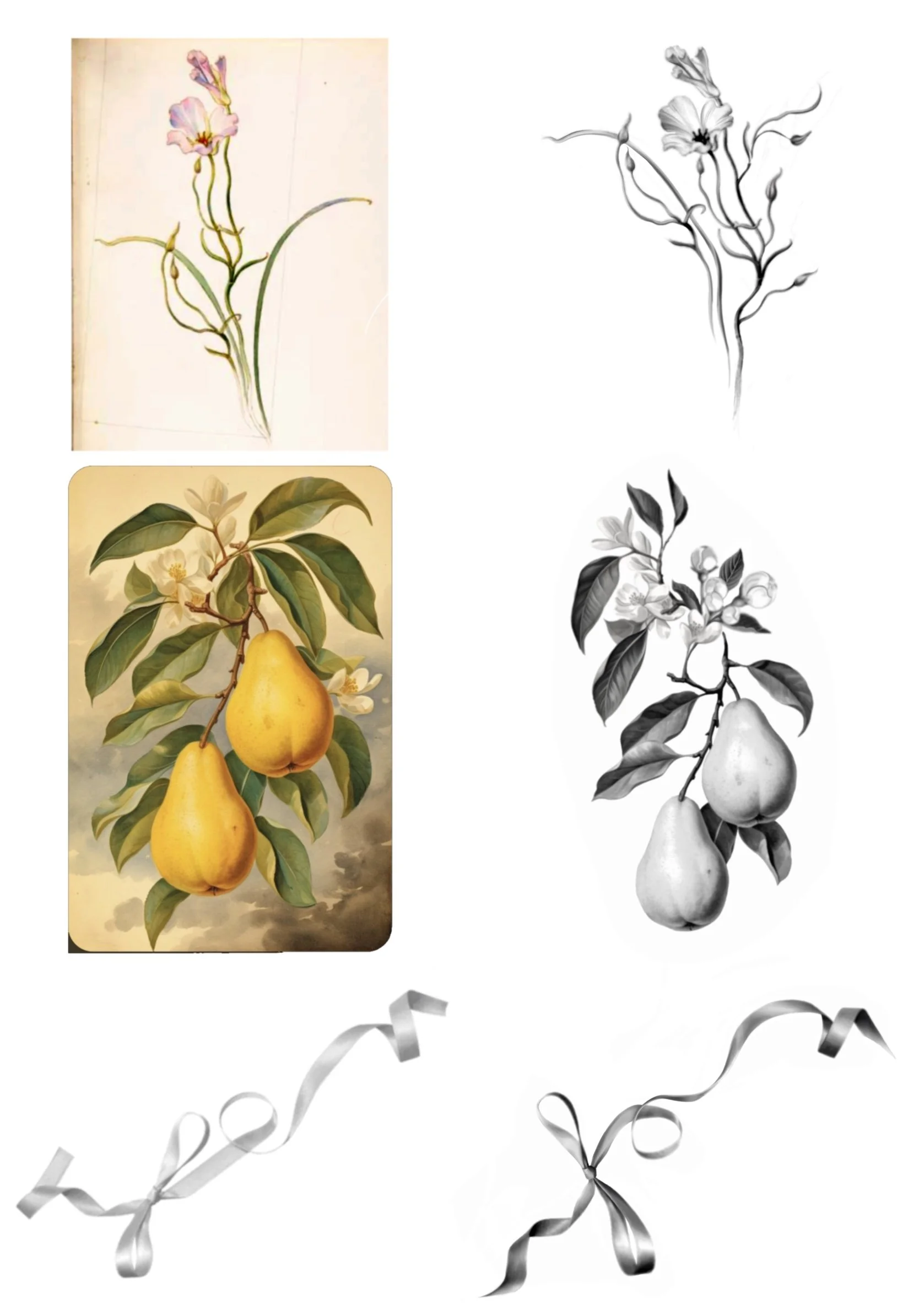
In some cases, I can combine or layer multiple images to create new compositions, especially for floral arrangements or textural designs. However, significant alterations - like rotating a subject’s orientation, or redrawing complex garments - are typically outside the scope of my process, as realism depends on accurate references from life.
